

Project:
Sales Dashboard
Deloitte
Overview & Objective
Deloitte needed an easy to use dashboard interface (B2B) for Sales Managers or Sales Representatives of all levels. This included several opportunities in various different stages displayed for the Sales Representative to easily make insights and act on it quickly. We were tasked to help guide the user on how to take the most effective action to closing out won opportunities.
Business Context
Deloitte’s previous system, Jupiter, was lacking intuitive visuals and the ability to easily direct or motivate the user to take proper next steps. One of the biggest complaints was that their data was not “actionable” meaning it was not easy for the user to look at the data and know what needed the most attention or or how to make best use of their time. For example, if an account is in a stage that is predicted to close soon in the sales pipeline, Deloitte sales representatives needs a user interface that can guide them on what actions to do next to help enhance a close out won strategy.
Discovery & Research
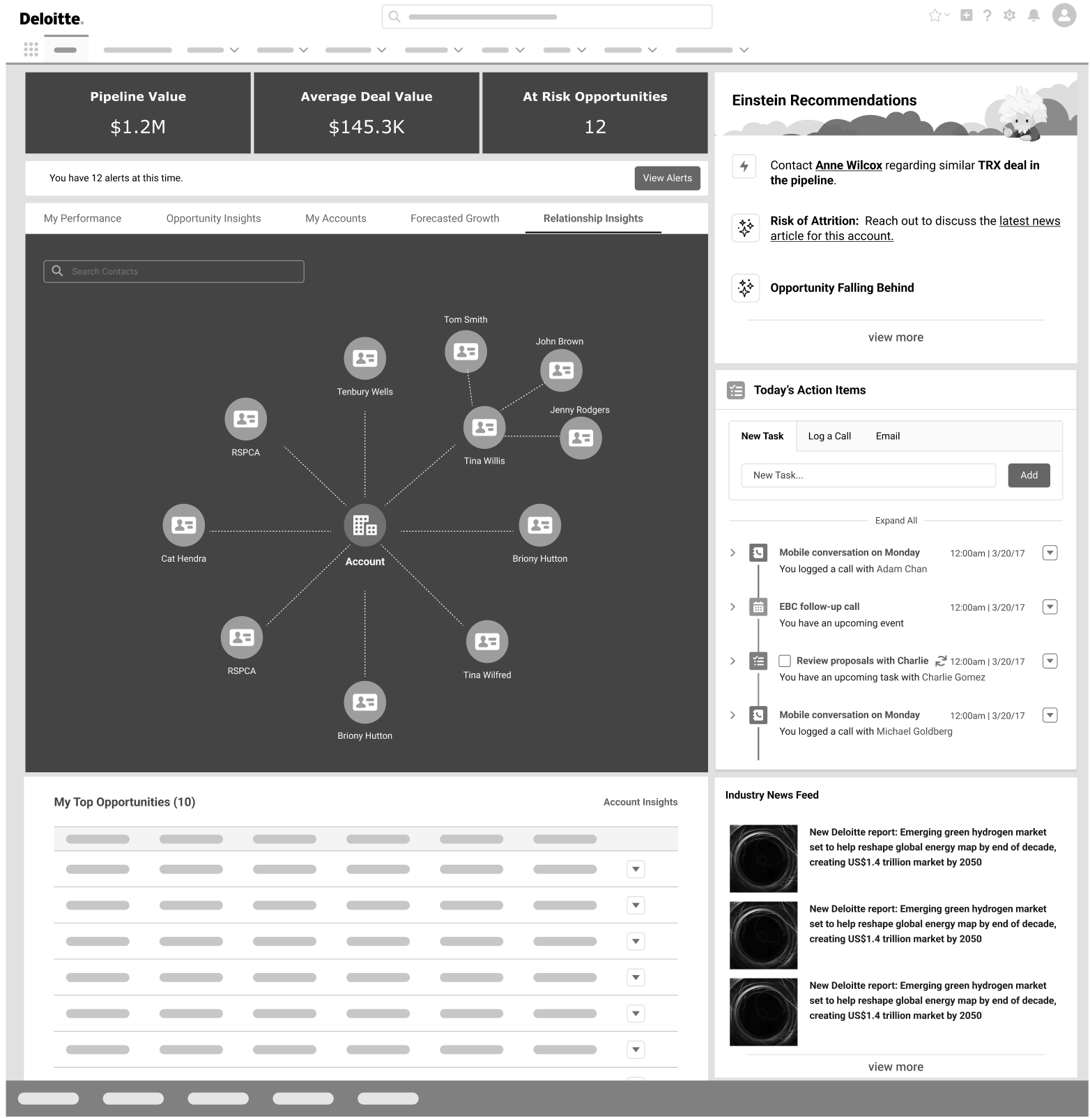
After meeting with the customer and doing personal research on what would help this type of user, we landed on a dashboard that allows the user to view important factors that help them view their opportunities and take action on them accordingly, view overall information on the accounts they are assigned, address where gaps are with their offering portfolios and the accounts assigned to them, view relationship insights within Deloitte and outside of Deloitte, and a way to view the sales manager or sales representatives’ specific performance, and address any network trends.
We started by doing quick iterations of low fidelity wireframes in order to get feedback and make quick changes based on stakeholder feedback. We kept the low fidelity stage as short as possible, so that we could get closer to what the final product would look like in production (High Fidelity Clickable Prototypes).
Design Iteration & Prototyping
Challenges Faced:
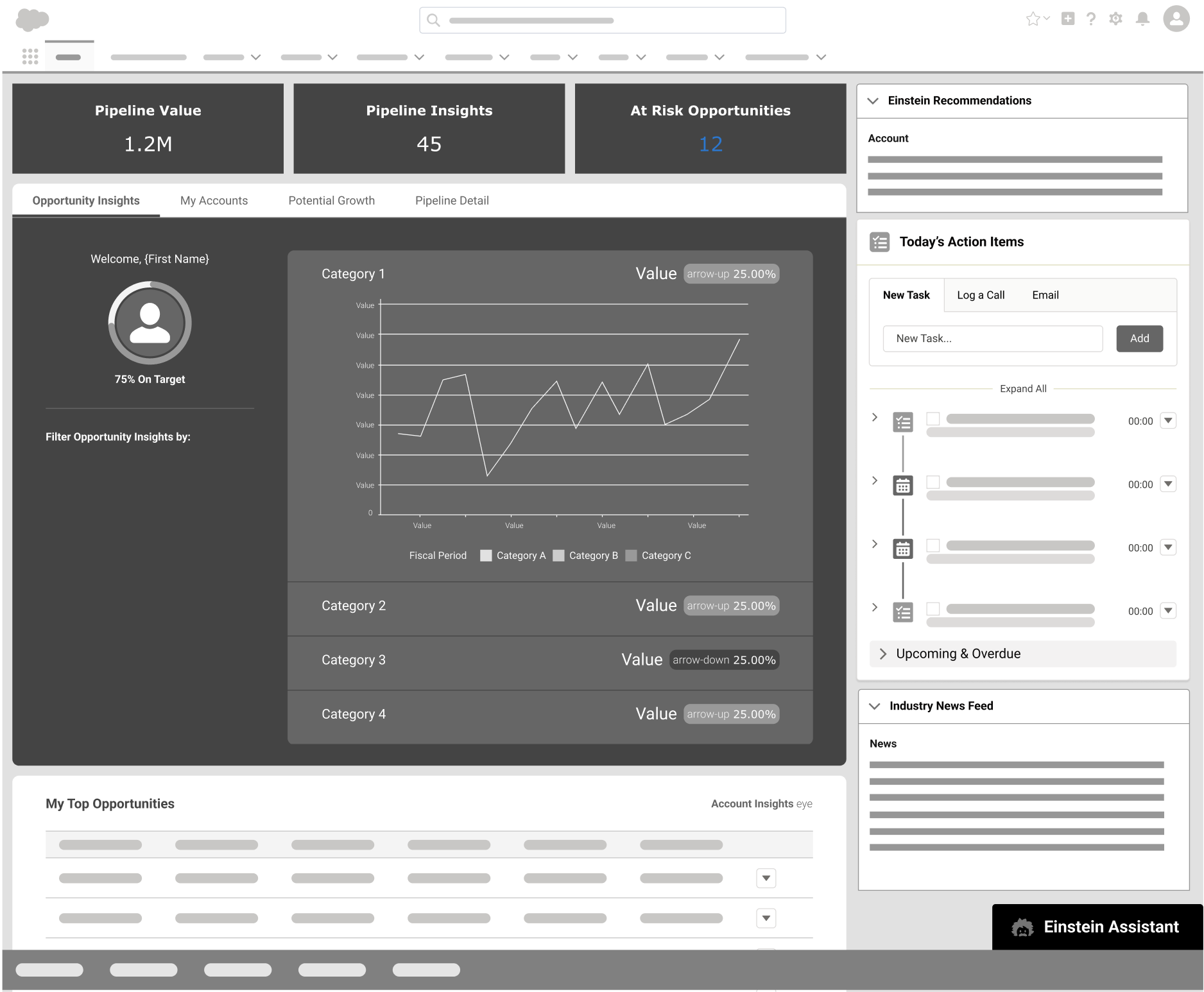
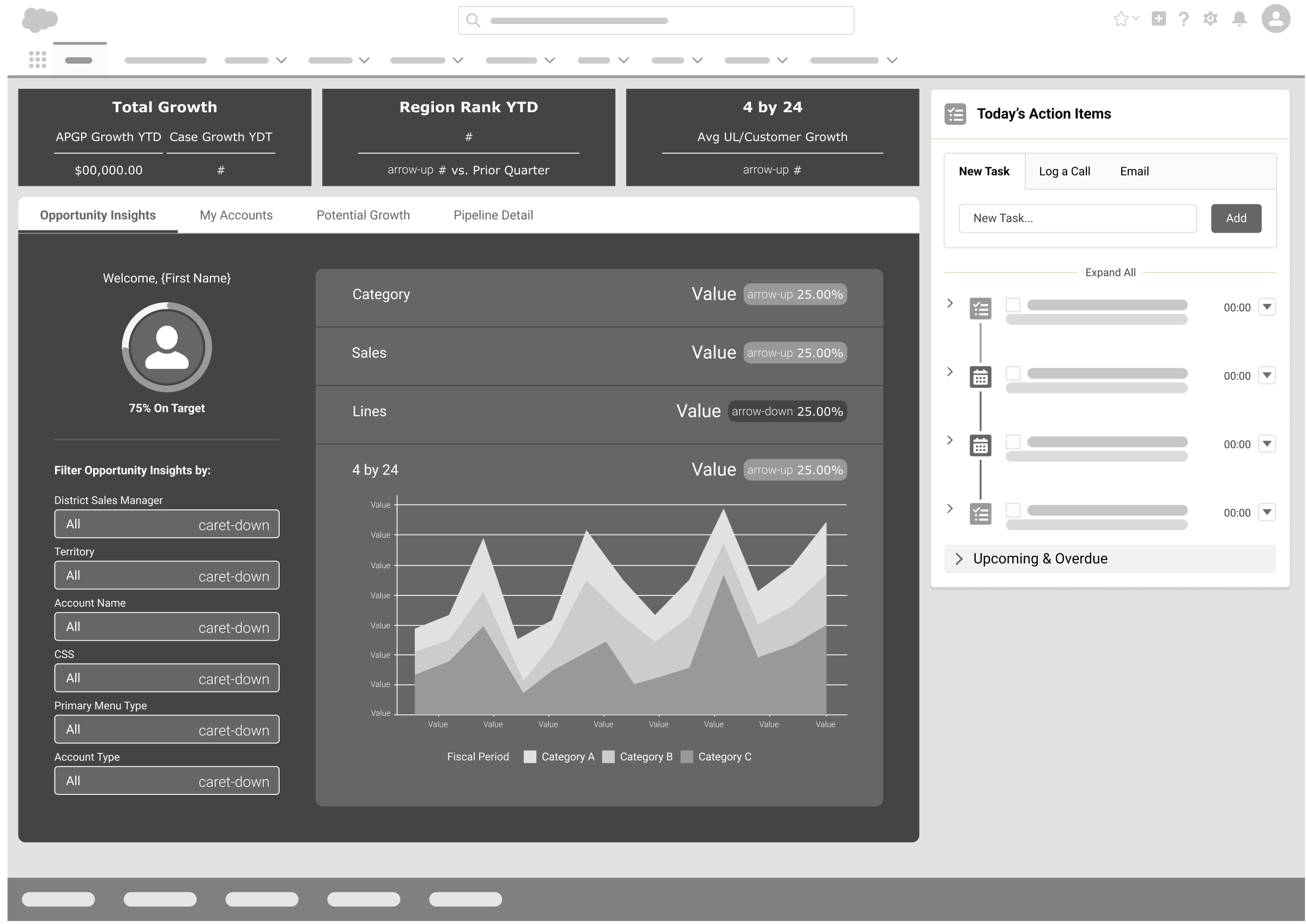
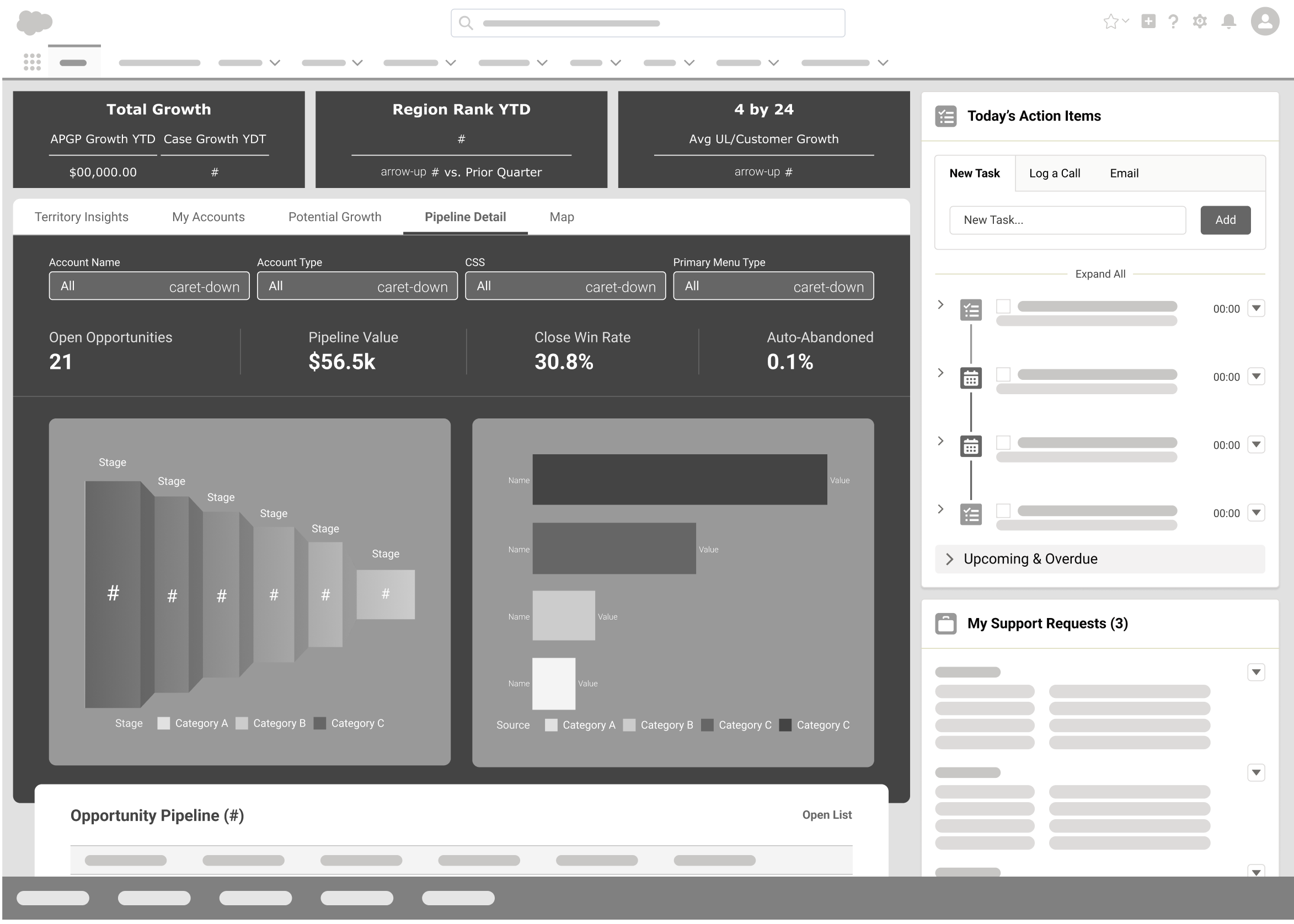
The initial instructions given to us by Deloitte was that they needed a dashboard for high level managers to view several opportunities and several accounts. We quickly did user research by interviewing high level managers that we wanted to cater to, but we realized there were some sales representatives who only had 5 or 10 opportunities that still used this tool even though they were not as high up in Management. This quickly changed our initial idea of focusing on ~100+ opportunities to now realizing maybe that should not be the forefront if we want to make this as universal and “one size fits all” as possible. This allowed us to shift our design to have more insights and actionable data for the user no matter what level in sales the user is in. We created an initial clickable prototype that we thought fit the stakeholder’s needs and demoed the prototype for feedback.
Design Iteration Clickable Prototype
AI Integration:
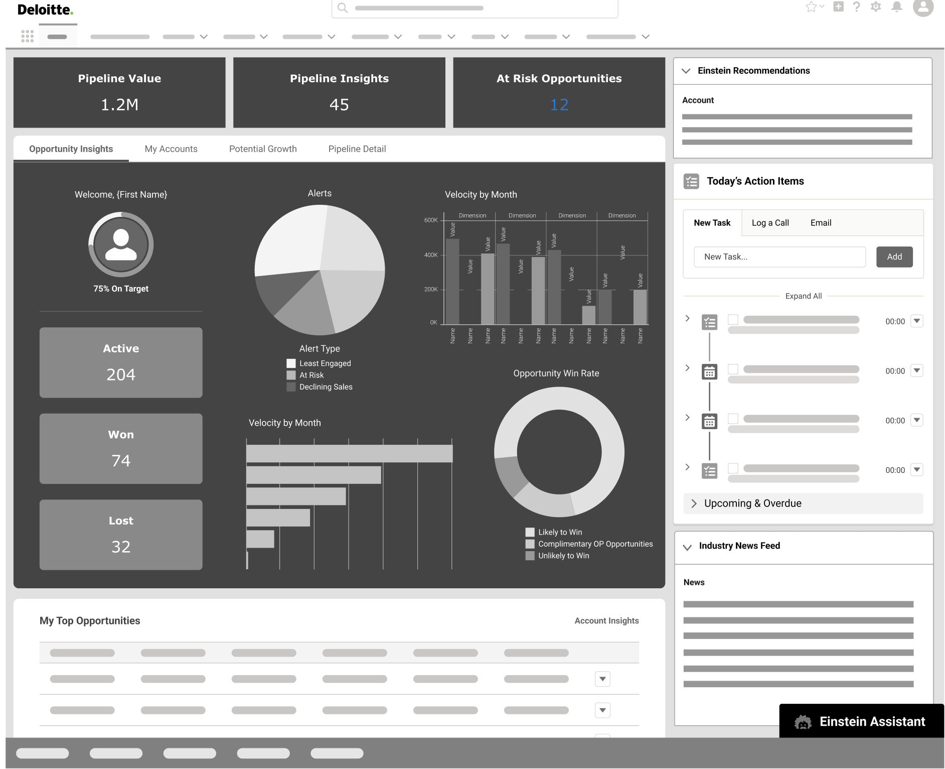
After more iterations and reviews with the client, they stressed the need for more “actionable” ways for the users using the dashboard. We thought a good way to incorporate that would be to add Salesforce AI Technology called Einstein. This is an interactive chat tool where the user can ask certain questions and get guidance from it as well.
For example, the sales representatives could ask what should be priority for a certain account, and Einstein will analyze data and suggest an action based on the question asked, with buttons to help the user go to the right place or contact page for example. This video shows the clickable prototype with potential outcomes from user requests.
AI Clickable Prototype
Outcome & Impact
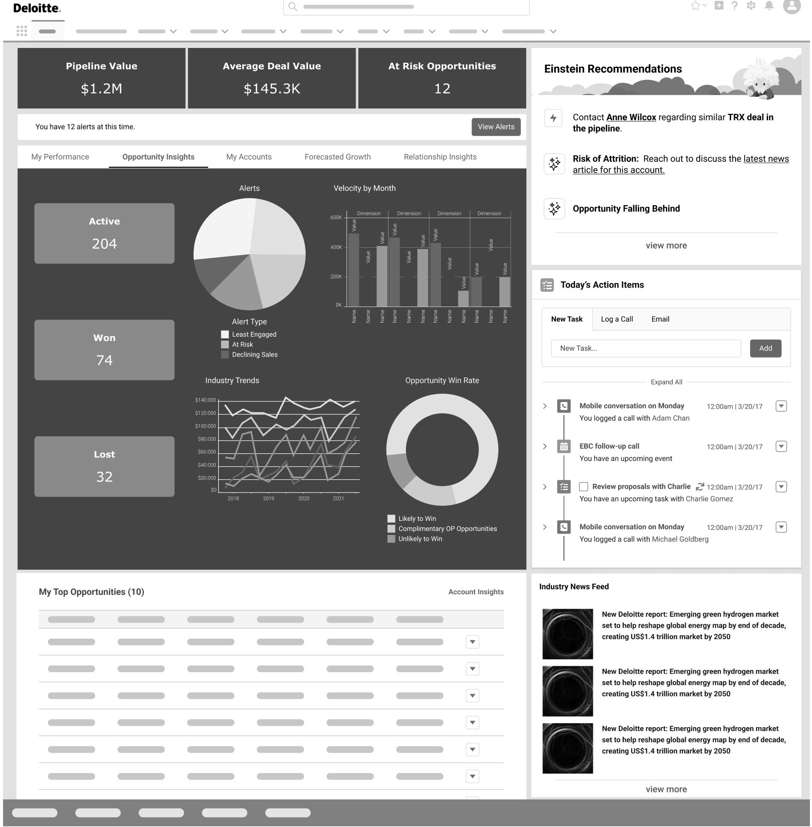
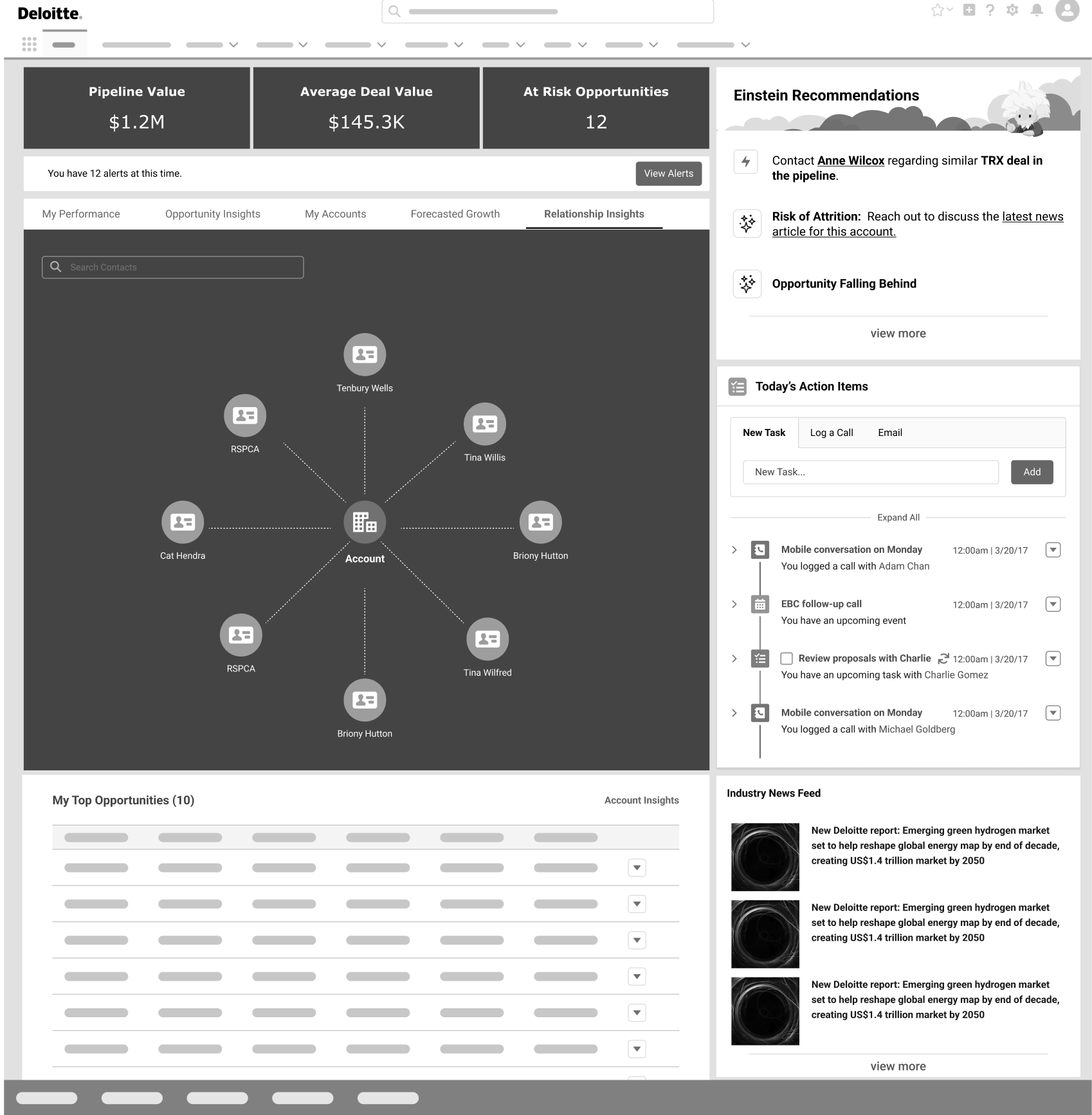
Initially, we aimed for a very robust interface. For example, we tried to leverage Salesforce’s out of the box AI chat functionality shown above in the previous video. We also tried using “Einstein’s Next Best Action” (shown in the first video) - this tool would direct the user on what actions to take to accomplish tasks quickly and effectively. For example, if the Sales Manager needed to follow up with someone, Einstein Next Best Steps would suggest drafting an email, and even assist in drafting the email for the user.
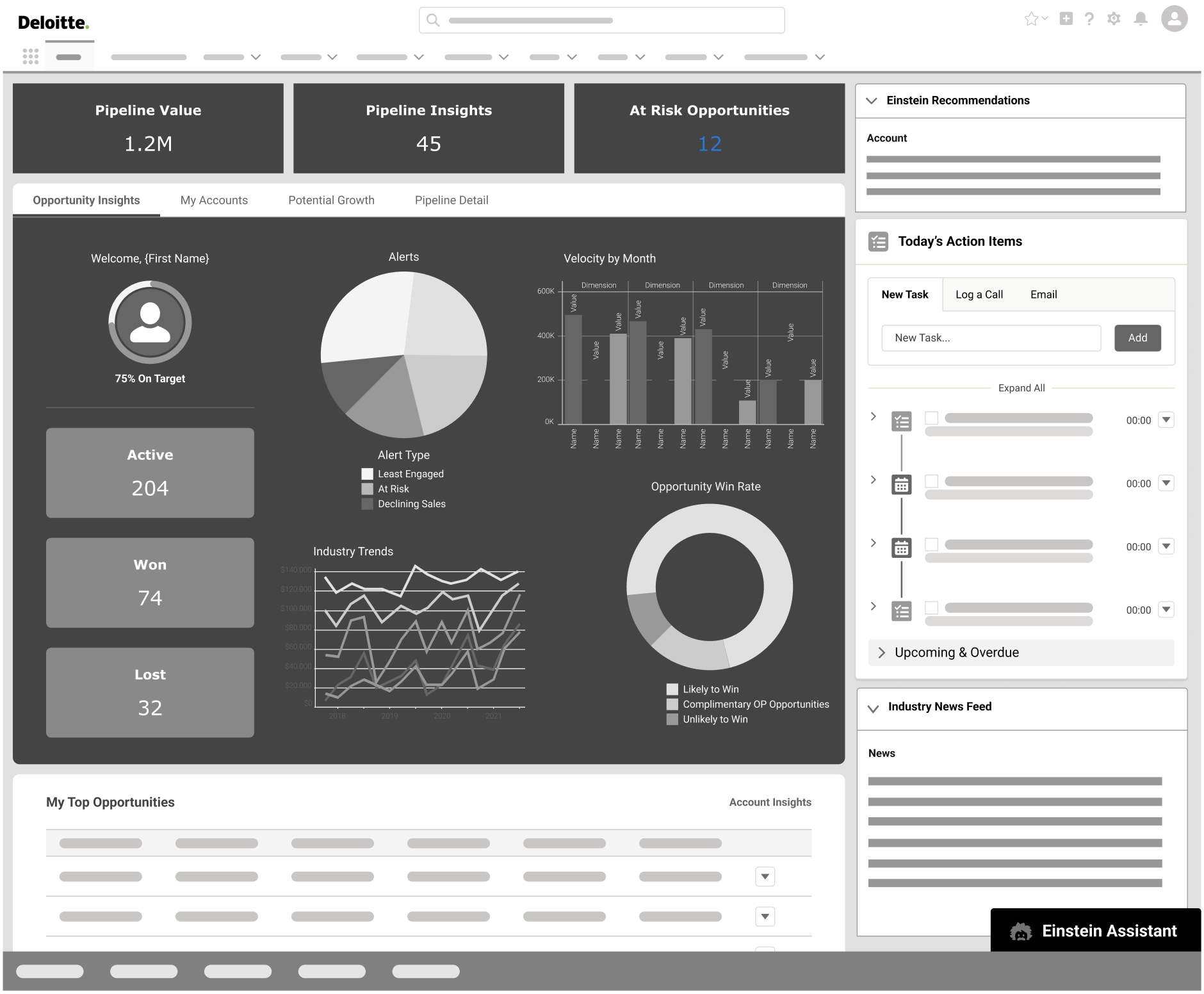
However, a couple months into the project, we found out we would not be able to obtain licenses for this tool, the Einstein chatbot tool, and many other tools due to lack of outside data. This meant we had to shift our interface to be as “actionable” as possible with the tools we could implement without restrictions.
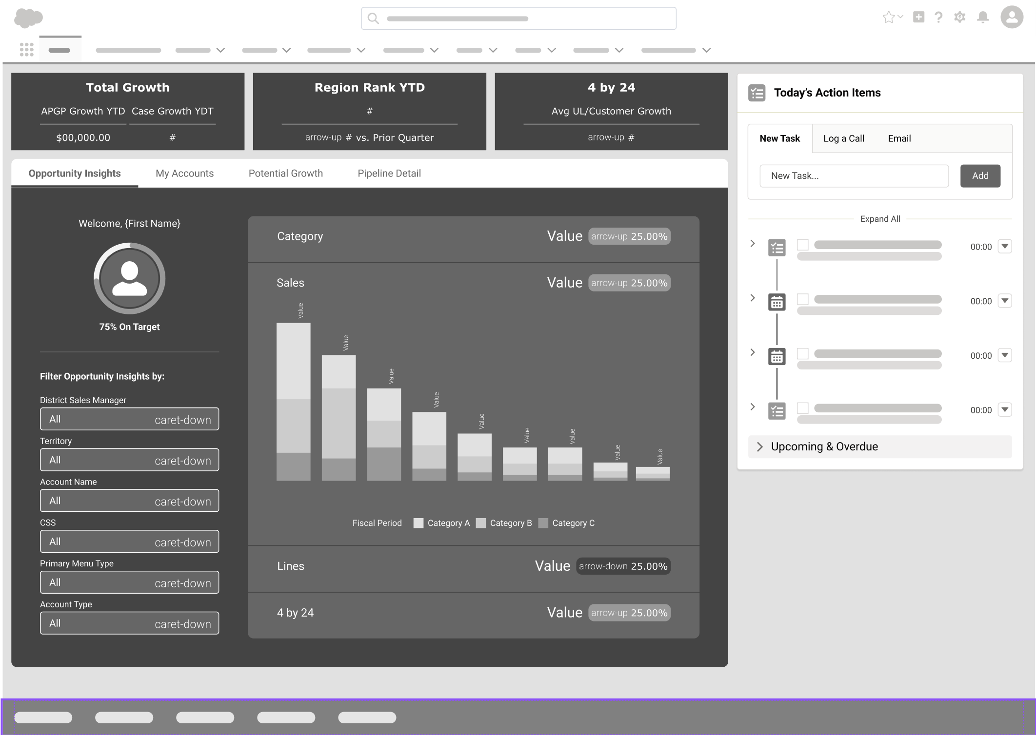
This left us with very limited functionality to use, so we decided to make the dashboard a tile styled approach. Each tile represented important topics most sales managers or reps needed to be aware of, and a button at the bottom of each tile which linked them to a corresponding or a more detailed view of the information. We went from a very robust and actionable approach, to having to unfortunately water down most of the more lavish functionality due to the lack of data and licensing issues.
Final Prototype
Ultimately, the client wanted to use more robust and current out of the box salesforce tools, and have visibility into data points outside of their company (ex/ market trends) however, after explaining to the client that because of licensing issues on their end, and lack of access to certain data points, we explained that we would need to make a more simplified dashboard. They were understanding and very appreciative of the outcome overall. They agreed that it was also as “one size fits all” as possible for the different levels of sales users and thought our designns addressed most of their pain points of their current system. So even though it was not as appealing and futuristic as desired, it still made their overall user experience more digestible which they were very appreciative of. Overall, even given the hiccups, I would consider the outcome a success, or a step in a more AI futuristic outcome.